


Color schemes are the unsung heroes of design, quietly influencing our emotions and perceptions without us even realizing it. Whether it’s the calming blues of a spa or the energetic reds of a fast-food joint, colors have a powerful way of setting the mood. Imagine walking into a room painted in neon green—unless you’re a fan of highlighters, it might feel like a rave gone wrong!
Overview of Color Schemes
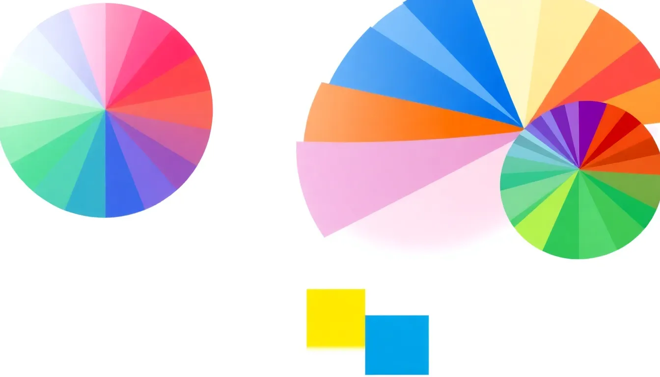
Color schemes consist of combinations of colors used in design to create a specific feel or atmosphere. Complementary colors sit opposite each other on the color wheel, like red and green, enhancing visual contrast. Analogous colors, located next to each other, blend harmoniously; for instance, blue, blue-green, and green evoke tranquility.
Monochromatic schemes utilize variations of a single color, providing a cohesive look. Designers often employ triadic schemes, combining three evenly spaced colors on the wheel, such as red, yellow, and blue, to achieve vibrant and dynamic visuals.
Warm colors, like red, orange, and yellow, invoke excitement and energy. Cool colors, including blue, green, and purple, create calmness and relaxation. The choice of color directly influences mood, making it a critical element in spaces like offices, homes, and restaurants.
Color psychology studies how specific colors impact behavior and emotions. Blue tends to evoke trust, which is why many banks use it. Yellow, associated with happiness, attracts attention, often appearing in advertising.
When selecting a color scheme, cultural context matters. Different cultures attribute unique meanings to colors; for example, white symbolizes purity in Western cultures but mourning in some Eastern societies.
Methods for testing color schemes include digital mock-ups, color swatches, and live prototypes. Assessing the interaction of colors in various lighting helps gauge their effectiveness in a design project.
Color schemes significantly affect perceptions and feelings, guiding choices in design and branding. Understanding their impact allows designers to communicate more effectively through visual mediums.
Types of Color Schemes
Color schemes play a crucial role in design, inspiring various feelings and reactions. Understanding the different types helps in selecting the right palette for any project.
Complementary Color Schemes
Complementary color schemes consist of colors opposite each other on the color wheel. Examples include blue and orange or red and green, creating a dynamic contrast. Such combinations grab attention and add vibrancy to designs. They work well in marketing and branding materials, making key elements stand out. Designers often use this scheme in logos and advertisements to evoke strong emotions.
Analogous Color Schemes
Analogous color schemes feature colors that are next to each other on the color wheel. This design creates a serene and harmonious effect. For instance, using green, blue-green, and blue fosters a calming atmosphere. Such schemes are ideal for spaces where relaxation is essential, like bedrooms and wellness centers. They promote unity and consistency, making it easier for the viewer to navigate the design smoothly.
Triadic Color Schemes
Triadic color schemes involve three colors that are evenly spaced around the color wheel. For example, red, yellow, and blue create a balanced yet vibrant look. This scheme offers variety while maintaining harmony, allowing for creative expression without overwhelming the viewer. Artists and designers appreciate this method for using bold combinations effectively. It’s particularly useful in illustrations and artwork, where visual interest is vital.
Monochromatic Color Schemes
Monochromatic color schemes utilize variations of a single hue. This creates depth through tints and shades of that color. Using lighter and darker tones of blue, for instance, can evoke mood and sophistication. Such schemes are versatile, suitable for minimalistic designs or contemporary settings. They simplify color choices while adding elegance and unity to any project.
Importance of Color Schemes in Design
Color schemes play a crucial role in effective design. They influence emotions and perceptions, guiding viewer responses in various contexts.
Emotional Impact of Color
Colors evoke specific feelings. Blue often creates calmness and tranquility, making it perfect for spa environments. Reds, on the other hand, generate excitement and energy, which aligns with fast-food restaurants aiming to enhance appetite. Green provides a soothing backdrop for relaxation, while yellow adds a sense of happiness and warmth. Each color can trigger particular emotions, impacting how individuals interact with spaces and products.
Color Schemes in Branding
Brand identity relies heavily on color schemes. Businesses utilize colors to convey messages and values, strengthening brand recognition. For instance, companies like McDonald’s use red and yellow to symbolize energy and positivity, effectively drawing in customers. Starbucks employs green to evoke a sense of nature and freshness, aligning with its commitment to sustainability. Consistent color use in branding creates familiarity and trust, reinforcing consumer loyalty.
Tips for Choosing Color Schemes
Selecting the right color scheme enhances design efficacy. Consider these key elements when making choices.
Understanding Color Theory
Understanding color theory forms the foundation for effective color scheme selection. Color wheels illustrate primary, secondary, and tertiary colors, helping visualize relationships. Complementary colors create striking contrasts, while analogous colors generate harmony. Each color has its own psychological impact, influencing emotions and perceptions. For instance, blue promotes calmness, while yellow evokes happiness. Designers often use color theory principles to enhance visual appeal and emotional resonance in various environments.
Tools for Selecting Color Schemes
Numerous tools simplify the color scheme selection process. Online color palette generators, such as Adobe Color and Coolors, offer users a wide range of options. These platforms allow designers to experiment with different combinations and visualize their choices. In addition, design software like Photoshop and Canva includes built-in color picking tools, streamlining the selection process. Utilizing these resources ensures a more informed and effective decision-making process when establishing color schemes.
Understanding the role of color schemes is essential for anyone involved in design or branding. The right color combinations can evoke emotions and influence perceptions in powerful ways. By leveraging color theory and psychological insights designers can create spaces and brands that resonate deeply with audiences.
Utilizing tools and resources available today makes selecting the perfect color scheme easier than ever. Whether aiming for harmony or contrast each choice carries significance that shapes experiences. Embracing the nuances of color can lead to impactful designs that not only attract attention but also foster lasting connections.