
Your living room walls are a blank canvas, and they deserve thoughtful design. Unlike a coat of paint or a quick furniture swap, wall design shapes the entire mood of the space, it’s where color, texture, and personality converge. Whether you’re working with a small apartment or a sprawling family room, smart wall choices set the foundation for a space that feels intentional and inviting. This guide walks through the core decisions that matter: color selection, wall treatments, décor placement, accent walls, and lighting strategies that bring everything together. You don’t need a designer’s budget to get this right: you just need a plan.
Table of Contents
ToggleKey Takeaways
- Wall design for living room starts with choosing the right color palette based on natural light direction and existing furnishings, using the 60-30-10 rule to balance neutrals, secondary colors, and accents.
- Paint is the most practical wall treatment for living rooms, but wallpaper and textured finishes like Venetian plaster offer personality and depth when application quality is prioritized.
- Artwork and décor should occupy roughly 30% of wall space, hung at eye level (57–60 inches), and arranged thoughtfully to avoid overwhelming small spaces or looking lost on large walls.
- Accent walls create visual impact by choosing the wall opposite main seating or those with fewer openings, using darker shades to add intimacy or lighter shades to brighten spaces.
- Layered lighting with warm bulbs (2700K–3000K), strategically placed sconces, and dimmers transform how wall colors and textures appear, making lighting an essential part of wall design strategy.
Choose The Right Color Palette For Your Living Room
Color is the first decision most people make, and it’s also the easiest to change, but getting it right the first time saves time and money. Start by considering the light in your room. North-facing walls look cooler and benefit from warm neutrals or soft yellows: south-facing walls handle cooler tones like blues and grays without feeling cold. Test paint samples on your actual walls and observe them at different times of day. Midday brightness looks very different from evening light.
Neutrals like warm whites, soft grays, and warm taupes work across nearly any style and provide a stable backdrop for furniture and art. If you want color without commitment, try 60-30-10: 60% neutral base (walls), 30% secondary color (accent wall or large furniture), and 10% accent color (accessories). This ratio keeps a room from feeling overwhelming while still allowing personality to shine.
Consider your existing furnishings and flooring. A room with warm wood floors pairs better with warm paint undertones, while cool gray tones complement contemporary spaces with cooler-toned finishes. Creating a cohesive design, starting with wall color. The best palette is one that makes you want to spend time in the room, aesthetics matter less than comfort.
Select Wall Treatments That Match Your Style
Paint vs. Wallpaper vs. Textured Finishes
Paint remains the most practical choice for living rooms. Use a semi-gloss or satin finish for easier cleaning in high-traffic areas: matte finishes hide imperfections but are tougher to wipe down. Plan for two coats and expect 350–400 square feet of coverage per gallon. Prep work, filling holes, sanding rough spots, and priming, determines finish quality more than the paint itself. Don’t skip primer on dark walls or glossy surfaces.
Wallpaper adds personality and depth that paint alone can’t match. Textured options like grasscloth or linen convey sophistication, while patterned papers can anchor a room’s style. Installation requires patience: measure twice, cut once, and book (soak) traditional wallpaper evenly. Prepasted varieties are faster but may not adhere as securely. Peel-and-stick wallpaper works for renters or those hesitant about permanence, though durability varies by brand. Timeless wallpaper ideas show that subtle patterns often outlast bold trends.
Textured finishes like Venetian plaster or faux techniques add visual interest without full coverage. These require skill and sometimes a second pair of hands, textured finishes show brush strokes and application flaws more readily than flat paint. If tackling texture yourself, practice on cardboard first. Hiring a professional for this work often yields better results than DIY attempts. Professional-grade design and décor strategies often incorporate these techniques for lasting appeal.
Incorporate Wall Décor And Art
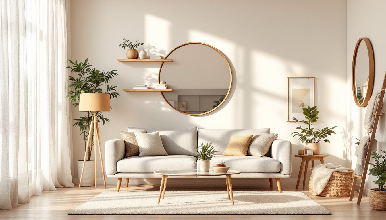
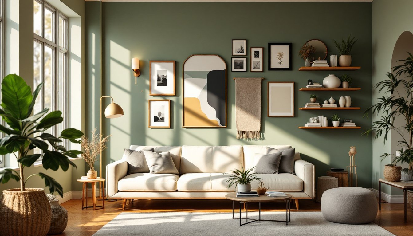
Art and décor anchor wall design and express personality. A large gallery wall draws the eye and fills blank space efficiently: arrange pieces on the floor first before hanging to confirm spacing and balance. Frames don’t all need to match, mixing wood, metal, and painted finishes adds visual rhythm. Hang artwork at eye level (57–60 inches from floor to center) for comfortable viewing while seated.
Consider mixed media: combine paintings, photographs, textiles, and three-dimensional objects like masks or sculptural shelves. Floating shelves provide function and style, use them for books, small plants, or curated objects rather than cramming them full. Mirrors amplify light and create the illusion of depth in smaller rooms: position them opposite windows or light sources for maximum effect.
Wall-mounted lighting fixtures, sconces, or artistic fixtures also serve as décor. A statement pendant or modern sconce becomes functional art that enhances the room’s overall composition. Keep proportions in mind: oversized art on a small wall can overwhelm: a single small piece on a large wall looks lost. Aim for art or décor to occupy roughly 30% of your wall space, leaving breathing room for the eye to rest.
Create Visual Interest With Accent Walls
An accent wall draws focus and adds drama without committing all four walls to bold color or pattern. Choose the wall opposite the room’s main seating area or a wall with limited windows and doors, fewer openings mean fewer paint edges to cut around. A darker or more saturated version of your main color works seamlessly: a contrasting hue creates stronger visual impact.
Before painting, step back and visualize the result. Darker accent walls can make a large room feel more intimate: lighter accent walls brighten darker spaces. Avoid placing an accent wall where it competes with large windows or artwork, you want it to enhance, not battle, your focal point.
Pattern is another accent strategy. A single patterned wall behind a sofa or bed anchors a room without overwhelming it. Grasscloth, geometric prints, or subtle textures work across multiple style aesthetics. The key is restraint: one bold wall is striking: two bold walls start to clash. Paint the remaining walls in a neutral that pulls one color from your accent wall to maintain cohesion and visual flow. Interior design professionals often use this principle, MyDomaine’s room-by-room guidance demonstrates how strategic accent application transforms spaces.
Use Lighting To Enhance Your Wall Design
Lighting dramatically alters how colors and textures read on walls. Warm white bulbs (2700K–3000K) create coziness and complement warm paint undertones: cool white (4000K–5000K) enhances modern, minimal spaces. Layered lighting, ambient overhead, task-focused sconces, and accent spotlights, gives you control over mood and function.
Wall sconces flanking artwork or mounted on either side of a mirror provide even illumination for reading or grooming without harsh shadows. Track lighting or picture lights highlight accent walls or gallery arrangements, directing attention where you want it. Uplighting behind floating shelves or along baseboards adds subtle depth and can make walls feel less flat.
Consider dimmers for overhead and sconce lighting. Dimming warm light creates intimate evenings: brightening gives you functionality for activities. String lights, LED strips, or neon art pieces add contemporary flair if they match your style, they’re not practical for all spaces but can transform a feature wall into something dynamic. Test bulb types and positioning before permanent installation: the difference between unflattering and flattering lighting is often just the right wattage and color temperature. Thoughtful home design approaches integrate lighting as a core element of your wall strategy from the planning stage.
Conclusion
Wall design anchors your living room’s personality and function. Take time on color selection, choose a treatment that suits your lifestyle (paint for simplicity, wallpaper for character, texture for sophistication), layer in art and décor thoughtfully, use accent walls strategically, and let lighting work with your palette rather than against it. Start with one or two elements, maybe color and a piece of art, then build from there. Living rooms evolve, and good bones (neutral bases, quality paint, well-placed lighting) give you room to adapt as your style matures.